Spin Info Solutions

Designed a bold and modern logo for Spin Info Solutions, featuring an “S” mark that represents speed, connection, and digital innovation — capturing the brand’s identity as a trusted IT solutions partner

Services

 IT consulting. Software development. Web and mobile solutions. Cloud integration. Data management. Branding and digital support for enterprises

Team

Team Hype Creative

The Problem

The company lacked a modern and professional identity. Its branding did not reflect innovation or reliability in technology. The presence across platforms was inconsistent and failed to inspire client trust.

Goal

Create a strong, professional identity that signals expertise and trust in IT solutions. Build recognition in the digital services market. Position Spin Info Solutions as a modern, dependable, and growth-focused partner for businesses.

The solution

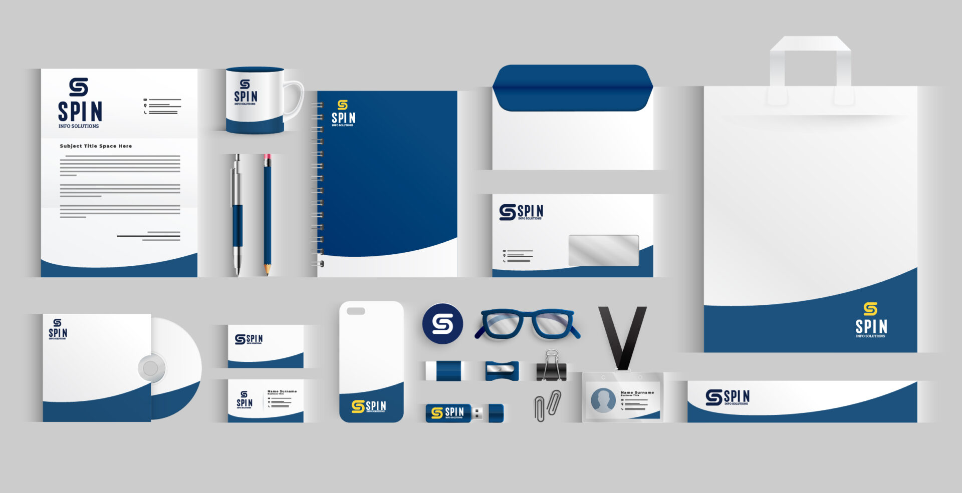
Designed a bold logo with a clean “S” mark to symbolize speed, connection, and digital flow. Used a strong yellow on navy palette to express confidence and clarity. Built a visual identity system that works across web, apps, and print. Developed digital assets to enhance credibility on platforms like LinkedIn, websites, and client presentations. Produced print materials that reinforce professionalism. Together these steps created a complete and consistent brand identity for Spin Info Solutions.